

It was shocking for me to realise the other day that I have been working in the digital PR industry now for over twelve months!
I have learnt so much this past year, from what digital PR actually is, how it can aid with search engine ranking, and what makes an effective campaign.
Since starting, I’ve had the privilege of working on over 70 different campaigns for a large variety of clients. At the start of 2021, I set upon myself to achieve 500 placements (mentions and links, on sites with a DA of 20+) before December 31st, and I am so chuffed to say that today (Oct. 26) I reached it!
In the light of having something to celebrate, I thought I would look back on all of the campaigns I have done the last year and highlight 11 of my favourites.
1. Every country’s favourite retro video game, mapped

Asset link: https://manyspins.com/blog/mapped-each-countrys-favourite-retro-video-game/
I absolutely adored working on this campaign – and that’s why I want to talk about it first. It was a large project that involved researching ‘retro’ video games – to select what constituted as retro, I chose games that were celebrating key milestones in 2021 – Pokemon celebrated their 25th anniversary, and The Legend of Zelda have celebrated 35 years since the first game.
I love video games, so of course this interested me. It also meant I got to learn a lot more about SEMrush keyword search volume tool, too, as the core aspect of this campaign was searching for the monthly average keyword volume for each game, in each country that SEMrush held data for.
It was super interesting, and I love the graphic that my colleagues worked on!
2. Which royal family has the most expensive tiara collection?

Asset link: https://www.money.co.uk/home-insurance/royal-tiaras
This actually wasn’t my campaign originally – which is what I loved about. On first outreach, this campaign did not pick up at all, and the feedback was that the insurance angle was too convoluted for journalists to write a good story on. My role in this campaign was simplifying it by removing the insurance angle from the press release, and focusing only on the cost of tiaras. The blog, therefore, served as a more in-depth analysis of the royal crowns examined. This time around, the PR was picked up more favourably.
3. Which social media platform had the most content violations in 2020?

Asset link: https://www.rebootonline.com/digital-pr/assets/social-media-platforms-biggest-increase-removed-content/
I LOVED this, especially since I enjoy learning about digital spaces such as social media. Social media transparency reports are incredibly important, even more so now as we face heavier and heavier scrutiny on the policing of online spaces. It was very interesting – and harrowing – to discover the reasons why social media platforms remove content.
There was a mild concern in my mind that Zuckerberg would sue me after writing this asset, but that was just an over-active imagination.
4. Data reveals which games players love to rage quit the most

Read about the findings at Invision Community.
Again, the main reason I loved this campaign was because it was video game related. I love putting together consumer surveys – they are so interesting, especially when you know you can rely on the results because they’re from reputable surveyors. This particular campaign combined survey data and keyword volume data, so to me, the game in top place wasn’t surprising – especially if you play Minecraft on Bedrock!
5. Fast fashion: which brands produce the most CO2 from each visit to their online shops?

Asset link: https://www.saveonenergy.com/uk/fast-fashion-and-co2/
If you’ve read my previous posts, you know that I am keen to reduce my waste as much as possible by reusing materials and shopping secondhand, so I was super excited to work on this campaign. This campaign evaluated the carbon footprint of each fast fashion website though websitecarbon.com, and then multiplied this number by the regional keyword search volume from each city in the UK.
It was incredibly interesting to learn about how and why website visits produce CO2, and then equally how website hosts can reduce the carbon footprint of their site – some examples of doing so include generating the electricity used to host the site through renewable means, such as solar or wind.
6. Who is TV’s worst fictional boss?

Read about the findings at TV Black Box.
I mean, who doesn’t love to get paid to watch TV?! Admittedly, this research had to take place outside of work hours, but to me – this was time well spent. I consume a lot of TV media anyway, so watching these shows was a past time I was more than happy to oblige.
By analysing the first five episodes of each show that featured the boss, and assigning numerical values to 12 different “terrible” actions, this campaign was able to rank TV show bosses from worst to least-worst — the higher the points value, the worse the boss. This was my first index-style campaign, and I’ve loved doing them ever since. Indexes, to me, provide a much more in depth analysis of a concept/idea since they evaluate multiple factors.
7. Which country produced the most high-scoring players?

Asset link: https://www.compare.bet/news/which-country-produces-the-champions-leagues-top-goal-scorers
This campaign absolutely FLOPPED. It was most data heavy campaign I had ever worked on, analysing 30+ years of Champions League players and recording how many goals they scored and what their nationality was, before plotting it on a graph. I was really impressed with the data I had collected, thinking it was interesting – but there was absolutely no bite from journalists, and the campaign received no coverage.
I still enjoyed it, though – it taught me a lot about defeat, and, as someone who has no interest in football nor no knowledge on the topic, it was somewhat interesting to learn about.
8. Which EU country has increased wind power production the most?

Asset link: https://www.saveonenergy.com/uk/eu-energy-production-from-wind-power/
eurostats is invaluable for anyone who works in DPR; there are so many (free!) data sets available that are incredibly comprehensive, legitimate, and a wealth of knowledge – these data sets can spark any number of campaign ideas. This campaign was so on-point for the client, and remains one of my biggest and most successful campaigns.
9. Which household utility provider has the most confusing T&C’s?
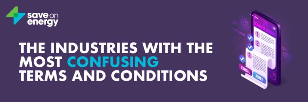
Asset link: https://www.saveonenergy.com/uk/most-confusing-terms-and-conditions/
As someone with an English Literature background, I was drawn to the basic concept of this idea: evaluating the terms & conditions of utility providers by feeding their text into reading age/ability calculators. I learnt a lot of literacy statistics through the research of this campaign; The Guardian reported in 2019 that more than NINE MILLION UK adults are illiterate. As a country with a huge emphasis on education standards, this is a shocking revelation. For this reason, and to help those with learning disabilities, the UK government recommends that all website content (especially on .gov websites) remains within the level of reading attributed to those aged 9-12 years old.
It is such a treat to be able to work on such varied campaigns, and I’m glad that Digital PR is a career I stepped in to!
